Image

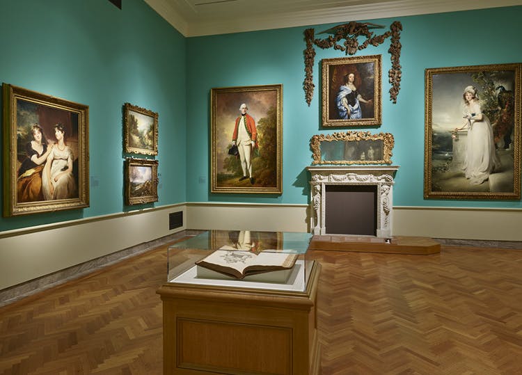
It is now the brightest wall color in the Cleveland Museum of Art. Larchmere is the contemporary name of the hue in the reinstalled British galleries; in the 18th century, for you trivia buffs, it was called Verditer.
“The new color literally changes the view of some of the most famous works on display,” says exhibition designer Jim Engelmann.
“Turner’s Burning of the Houses of Lords and Commons really pops now, so much more than when the walls were yellow. The pinks and lavender tones in the sky on the right side of the painting are details I didn’t see before,” he says. “Because of the rich oak floors, our gallery spaces tend to a yellow tone anyway, and that diminished the lavender in the depiction of the smoke and mist. Now it’s quite lively.”
These types of details were top of mind when Engelmann was working on the reinstallation with Stephen Harrison, curator of decorative art and design, and Cory Korkow, associate curator of European art. The wall color is historically accurate to the domestic interiors of an English manor house of the 1700s and early 1800s. “Installing paintings and sculpture alongside decorative arts enhances the visitor’s experience, helping
us to understand all the works in historical context,” Korkow says. “That resonance makes them even more beautiful.”
Rethinking the permanent collection galleries is a key initiative of Making Art Matter, the museum’s strategic plan for the next decade. The British reinstallation was made possible with major support from Jane and Douglas Kern. Additional support was provided by Ann and Richard C. Gridley. “This installation brings the ceramics and silver collection into greater focus,” Harrison says. “Visitors will be able to make vivid connections between decorative arts and paintings while thinking about the gallery space as a whole.”
The project began with an issue of tarnishing silver in the old cases and culminated in the first in-house construction of casework and lighting. The two new cases are smaller but have more shelving and a much better environment for silver. They are also the first CMA cases with steel structure to be built on-site and to use a discrete system of LED lighting.
“Our on-staff cabinetmaker, Justin Baker, did a fantastic job,” Engelmann says, “and then a local fabricator welded the steel frame. This is the first time we’ve tried this, and the results are superior.”
The reconfiguration of the galleries was to include a cabinet of portrait miniatures with doors to protect the delicate watercolors when not being viewed. Coronavirus safety protocols call for a touchless visit, so the doors came off and more durable snuff boxes now appear in that cabinet.

The British reinstallation introduces more than a dozen artworks that are either recent acquisitions or have not been on public view for decades. Newly acquired candlestands by Thomas Chippendale appear on either side of a portrait by Sir Joshua Reynolds to approximate their original configuration at Brocket Hall, the country house for which they were commissioned; the arrangement sits on a new platform.
Another new platform calls attention to the display of a recently reupholstered settee by Thomas Hope from around 1802, the Portrait of Hugh Hope from 1810, and a marble bust of Sir H. C. Englefield that was cleaned with a conservation laser the CMA acquired last year. Before the reinstallation, the settee featured purple upholstery, but a remnant of the original scarlet wool still clung to the back of the frame. Working with conservator Robin Hanson, Harrison arranged to have fabric specially woven and dyed to match that red.
“This little group really captures the mood of the whole gallery,” Engelmann says while looking at the three objects. “Stephen and Robin got that red color right, and to see the cleaned marble against the blue-green wall is amazing. I had seen all these pieces before, but to see them together, as Stephen and Cory have arranged them, makes it all feel cohesive. It really works.”
Cleveland Art, Fall 2020